- FEATURED
- ALL PROJECTS
- + ARCHIVE
- + CLIENT


- A&E
- ALFONZO RIVAS
- ANIMAL PLANET
- BANCO CANARIAS
- BDA & PROMAX
- CADA
- CANAL 9
- CANTV
- CASA CLUB
- CINEMAX
- DIE GESTALTEN
- DISCOVERY CHANNEL
- DISCOVERY H&H
- DISCOVERY ID
- DISCOVERY KIDS
- DISCOVERY NETWORKS
- DISCOVERY T&A
- DISCOVERY US HISPANIC
- DISNEY
- E! ENTERTAINMENT
- FOX LIFE
- FSC / WWF
- GRUPO UNO
- H. CAPRILES RADONSKI
- HBO
- HUMANUM
- INFINIA
- KIT-CHE-N
- LIFETIME
- MGM
- MUSIC FEST
- NEORIS
- NESTLE
- NICK
- NVIDIA
- OVO
- OWN
- PLAZA SESAMO
- POLAR
- RODRIGO GONSALVES
- SKY NETWORKS
- SONY
- STRUENDO
- TELEMUNDO
- TOTUMA
- TOTUMA LAB
- UNIVERSAL CHANNEL
- VENENO INC.
- VISA
- WARNER CHANNEL
- + CATEGORY
- AWARDS
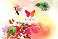
CASA CLUB.GRAPHIC PACKAGE 2010
Rebranding Casa Club TVWe started by eliminating the words "club" - this refers to an "elite" or "exclusivity" that was no longer relevant for the brand-, and "TV" -that limits the brand positioning in this all-media times-. We keep the word "CASA" and choose the image of a butterfly to go with it ( symbol of transformation and delicacy) This way we could start making the brand, graphically, a little more relevant for their audience. For the on-air look the did a more organic, modern and warmer image that the former one, and did an structure that supports the different diary programing blocks. The audience response has been extremely positive, but this is just the beginning.
Creative Direction
Hubert Reinfeld
Art Direction
Cristina Briceno
Vladimir Mihalkov
Animation
Marcial Gonzalez


